


Contents:
Have you ever wondered why the colour of your printed material doesn't always match what you see on your screen? We've all experienced it. In the world of printing, finding the perfect colour can be a challenge, but it's essential that the final product faithfully reflects the desired tones.
Ultimately, our aim is to ensure that our artwork and its colour palette look as good in real life as they do on screen. This is particularly important when we enter the world of CMYK colour model.
CMYK, also known as process color or 4 colour printing, is a colour model widely used in the printing industry, whose initials are Cyan, Magenta, Yellow and Key plate (black). This model is based on colour subtraction, where each ink absorbs or “subtracts” certain wavelengths of light to create a wide range of colours.
When combined, more wavelengths are absorbed and less light is reflected, resulting in darker colours.
Cyan (C)
In the combination of these four colours, cyan is essential for reproducing bluish and greenish tones.
Magenta (M)
The presence of magenta makes it possible to create colours in the red and violet range.
Yellow (Y)
Its incorporation into the mixture is essential for generating yellow and green tones.
Black (Key plate)
The mixture of cyan, magenta and yellow does not create pure black. This is why it is added to the CMYK color list to obtain a more intense black and improve the depth and contrast of the print.
The process colour is renowned for its ability to represent colours realistically in physical printed matter such as brochures, posters or business cards. Although its colour gamut is more limited than that of the RGB (Red, Green and Blue) model used for digital screens, the 4 color process is specifically designed to achieve accurate printing of tonal shades while faithfully reflecting the design.
When working with the CMYK colour charts, we think about how the inks will be mixed during printing to obtain the most accurate representation of the drawings. The inks are layered to create a variety of colours, which is essential if the final product is to correspond as closely as possible to the original vision on screen. This ensures consistent, high-quality results in commercial printing, where colour accuracy and faithful reproduction of detail are key.
The CMYK process is the key to accurate colour reproduction during the printing process. Unlike RGB codes, which are an additive system, CMYK codes are specific to printing and are based on the subtractive colour model.
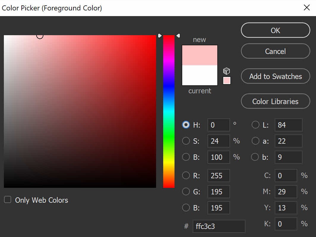
When graphic designers and print professionals talk about CMYK colour codes, they are referring to numerical values that indicate the proportion of each of the colours (cyan, magenta, yellow and black) to be used. These values, generally expressed as percentages from 0 to 100, determine the quantity of ink to be applied for each colour.
For example, a CMYK code of ‘30, 40, 60, 10’ means that 30% cyan, 40% magenta, 60% yellow and 10% black will be used, resulting in an olive grey colour. This combination will result in a mixture of inks during printing to obtain the desired colour.
The sum of these percentages does not always have to be 100%, as this depends on the design and the desired effect. Sometimes, the complete combination of the four colours is not necessary to obtain the specific hue, i.e. values of 0% can be used for some of them.
When working with colours, it is important to understand the differences between the different Pantone, CMYK and RGB color models, as each is adapted to specific contexts.
As we saw above, this model is the most appropriate for printing. It uses four basic colours which are superimposed to create a wide range of colours. The abbreviation stands for color cyan, magenta, yellow and black.
Black is added to enhance depth and contrast. CMYK codes indicate the proportion of each colour in the mix and are essential for obtaining accurate results on printed products such as brochures, posters and cards.
The RGB model, on the other hand, is ideal for digital screens, such as computers or televisions. It uses a combination of three basic colours: Red, Green and Blue, to generate a wide variety of shades.
Each colour is represented by a numerical value, 0 being the total absence of colour and 255 the maximum intensity. RGB coding is essential in the design of websites and in the creation of visual content for electronic devices.
Finally, the Pantone system is based on specific, consistent colours. Unlike the two mixing models mentioned above, it assigns a numerical code to each colour, allowing accurate reproduction in all situations.
This system is particularly important for logo and brand design, where colour consistency is essential. Originally designed for printing, it has also been integrated into digital production.
A lot of work goes into graphic design, and after all that effort we want the final result to be a faithful reflection of our vision. However, when we send a file in RGB format directly to the printer, the conversion to CMYK is done automatically, which can sometimes affect print quality.
As you can see, the RGB system has a much wider range of shades than the CMYK code. This means that the design will not always be exactly the same as the original. However, thanks to today's technology, we can get very close, as most professional photo retouching or illustration software only needs a few clicks to make the change.
Professional graphic design software
Use design software such as Photoshop, InDesign or Illustrator, which allow you to do RGB to CMYK color conversion without losing the original colour information.
Make sure you work in high resolution to maintain quality. Most of these programs use the RGB system by default. If your work is to be printed, it is preferable to use CMYK from the outset in order to keep modifications to a minimum.
Manual colour adjustment
When switching to the CMYK colour system, some colours may change slightly. Check and manually adjust the colours that may be affected, particularly vibrant and saturated tones.
You can also use a colour converter to convert color RGB to CMYK and determine the shade that is closest to the desired one.
It is essential to bear in mind the fundamental colours of the original design and check how they translate into RGB and CMYK. If the software has not detected certain changes, specific manual adjustments can be made to maintain visual consistency.
In addition, before mass printing, it is essential to carry out tests, or proofs, to assess how the colours will look on the paper. This will allow you to make further adjustments if necessary.
This format is mainly used in printing, but its usefulness goes beyond simple poster printing. Here are a few areas where the 4 color process printing plays a key role:
Commercial printing
In the commercial printing industry, CMYK color range is used to print a wide variety of documents, such as brochures, posters, catalogues, school supplies and personalised calendars.
Advertising
Print advertisements, whether in newspapers, magazines or on billboards, are often designed using CMYK color gamut to maintain the visual consistency of the brand across different media.
Packaging
For the creation of personalised packaging, such as boxes or customised paper bags, all CMYK colors are essential for accurately reproducing graphic details and logos, especially as this is an inexpensive system for large quantities.
Promotional material
For promotional material, such as business cards or leaflets, CMYK is recommended because of its ability to reproduce detail and its compatibility with the vast majority of printers.
Photographic printing
Photographic printing, whether for artistic or commercial purposes, is often carried out in CMYK to obtain high-quality results.
Publishing
Novels, manuals and other books printed in large quantities in the publishing industry also use 4 colour printing.
Creating a CMYK colour palette involves selecting combinations of black, yellow, cyan and magenta to obtain a variety of shades.
Here are a few suggested colour palettes with the respective percentages of each component to help you create visually appealing designs, ensure accurate printing or simply for inspiration.
Vibrant palette
Blue
Cyan: 100% / Magenta: 75%
Yellow: 0% / Black: 0%
Magenta
Cyan: 0% / Magenta: 100%
Yellow: 0% / Black: 0%
Yellow
Cyan: 0% / Magenta: 100%
Yellow: 0% / Black: 0%
Red
Cyan: 0% / Magenta: 100
Yellow: 100% / Black: 0%
Pastel palette
Blue
Cyan: 25% / Magenta: 10%
Yellow: 0% / Black: 0%
Magenta
Cyan: 0% / Magenta 20%
Yellow: 5% / Black: 0%
Yellow
Cyan: 15% / Magenta: 20%
Yellow: 0% / Black: 0%
Green
Cyan: 25% / Magenta: 10%
Yellow: 25% / Black: 0%
Contrast palette
Dark blue
Cyan: 100% / Magenta: 90%
Yellow: 0% / Black: 20%
Bright green
Cyan: 80% / Magenta: 0%
Yellow: 100% / Black: 0%
Deep purple
Cyan: 0% / Magenta: 100%
Yellow: 50% / Black: 0%
Bright yellow
Cyan: 0% / Magenta: 0%
Yellow: 100% / Black: 0%
Neutral palette
Dark grey
Cyan: 0% / Magenta : 0%
Yellow: 0% / Black: 50%
Light grey
Cyan: 0% / Magenta: 0%
Yellow: 0% / Black: 20%
Beige
Cyan: 5% / Magenta: 10% Yellow: 20% / Black: 0%
Remember that these are only suggestions and that you can adjust the proportions to suit your personal needs and preferences.
Also remember that changing RGB to CMYK can affect the appearance of colours, so it is always advisable to carry out CMYK proofs before large-scale production.
Working with CMYK colours can be tricky, and some common mistakes can affect the final quality of the print. Here are some typical errors and our advice on how to avoid them:
Not converting RGB to CMYK
Failing to perform the correct RGB to CMYK transformation can result in inaccurate colours when printed. Before submitting a graphic design for printing, make sure it is in CMYK colour model to obtain the most accurate results.
Relying solely on the screen
Most computer screens use RGB colours by default, which have a wider range than the CMYK colour chart for printing. It is preferable to carry out test prints to see what real colour reproduction will look like.
Ignore ICC profiles
An ICC (International Color Consortium) profile is a set of data that describes the colour characteristics of an input or output device. Each device has its own way of interpreting colours, and the configuration of ICC colour profiles makes it possible to translate these colours so that they are exactly the same everywhere.
Ignoring dot gain
This is the change in colour intensity that can occur when printing on paper or other substrates and which may be due to the type of ink, the printing substrate or the quality of the print.
Not checking critical colours
Some colours can change more radically when converted from RGB to CMYK, particularly those that are vivid or saturated.
Not working in high resolution
Working in low resolution can result in pixelated printing. Make sure your images are in high resolution for optimum print quality.
Using colours outside the printing range
Some RGB colours cannot be reproduced exactly in CMYK. Use a set of colours within the printable range and adjust them if necessary.
RGB colours
What you see on screen
CMYK colours
What you see in print
In conclusion, it is essential to understand the CMYK 4 colour print process to achieve accurate and vibrant print results. The combination of its colours offers a wide range of shades that enable images and designs to be reproduced with great fidelity.
Good CMYK colour management, together with attention to details such as resolution and colour profile, will contribute to consistent and professional print results. Armed with this knowledge, graphic designers and print professionals can take full advantage of the capabilities of the CMYK colour system to bring their creative vision to life with impact and quality.