
Facilitates effective communication.

Organizes and prioritizes information in the text.

Differentiates and highlights our message from the competition.

Conveys an image of who we are through written words.


Typography plays a fundamental role in written and visual communication. From the books we read to instantly recognizable logos, typography is the tool that shapes words and our perceptions.
But what exactly is it? In this article, we will explore all the important aspects of typography and its significance in various contexts.
Typography is not just the form in which text is written. Its origin from the Greek words "typos" (strike or impression) and "grapho" (write) reveals that it is the art of managing and selecting typefaces for print work.
But what is typography really for? Well, its function is deeper than one might imagine. Not only does it enhance the aesthetics of the text, but it also:
Facilitates effective communication.
Organizes and prioritizes information in the text.
Differentiates and highlights our message from the competition.
Conveys an image of who we are through written words.
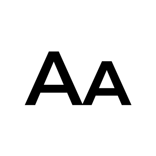
In reality, a character refers to the specific design of a single letter or individual character. This concept dates back to Gutenberg's invention of movable type, small pieces of lead representing each character. Each letter had its unique mold.
When we talk about typography, however, we refer more broadly to a set of letters, numbers, and symbols following a consistent and harmonious design. Typography encompasses the entire system of letters we use in a text or project.
Once we understand what typography is, it is also important to comprehend the meaning of type families, fonts, and typographic weights.
We call a typeface family the group of typefaces designed according to the same criteria, i.e., with the same appearance, structure, and distinctive features that are maintained in all their variants.
For example, we refer to typeface families when we mention Arial, Montserrat, Garamond, Oswald, etc.
Within a typeface family, we find the typeface, referring to the style or appearance of a group of characters following certain characteristics.
Continuing with the previous example, the Arial family has various typefaces like Arial Narrow, Arial Regular Condensed, etc.
The more numerous the fonts in a family, the richer and more varied it will be, and therefore, it might be used more extensively.
The different weights of a typeface refer to various variations within the same typeface family differing in the thickness of their strokes.
For example, we talk about different typographic weights when referring to Arial Bold and Arial Medium, even though both belong to the same family.
The number of typographic weight variants can vary; there is no minimum or maximum number of weight variants in typefaces. However, the most common ones usually include:
Thin > Extra Light > Light > Regular > Medium > Semibold > Bold > Extra Bold > Black
In addition to weight, there are other significant variants that influence the appearance of a font.
Typefaces can include different styles of weight, proportions, width, and other variables with small characteristics that distinguish them from others. The most relevant ones are:
Italic is a stylized variant of a typeface that slants letters to the right.
It is often used to emphasize words or phrases in text and provides an elegant and sophisticated appearance.
Small Caps, also known as "small caps," are letters that are the same size as lowercase but resemble uppercase in their height and thickness.
They are ideal for highlighting proper names or section titles in a subtle and elegant manner.
Similar to Small Caps but smaller in size, offering a subtle uppercase effect while maintaining the delicate appearance of lowercase.
They are commonly used in headings and subheadings to add style without overwhelming the design.
Incorporating these typographic variants can add visual diversity to your projects and documents, allowing you to play with different styles to achieve the desired impact on your audience.
Proportion is a typographic variable that plays a fundamental role in readability and the aesthetics of text. It refers to the ratio between the width and height of characters and thus the set of letters in a typeface.
Proper proportion ensures smooth and pleasant reading, avoiding letters appearing too crowded or excessively spaced. Furthermore, it can influence the personality and style of a font. A narrower proportion can convey elegance and formality, while a wider one can provide a modern and bold touch.
Typographies follow a design based on certain criteria and elements:
These typefaces have small decorations called "serifs" at the end of their strokes.
This characteristic makes them appear to rest on a line, making them perfect for continuous text and particularly for printing on paper.
They are usually associated with seriousness, antiquity, and tradition due to their historical origin and their use throughout history. This group further divides into other subclasses, each different with various meanings and connotations.
This style is the oldest and features serifs (small extensions or terminals) at the ends of letters.
Notable examples include Times New Roman and Georgia. They are widely used in printed text, especially in books and newspapers.
These typefaces are characterized by their thin and elegant serifs, along with more pronounced contrasts between thick and thin strokes.
Relevant examples are Bodoni and Didot. They are often used in editorial and fashion design due to their refined appearance.
The serifs in this style are rectangular and thicker compared to traditional ones, giving the letters a more solid and geometric appearance. They are often used in poster design and signage.
Typefaces like Rockwell, Courier, and Memphis are examples of this category. They are commonly used for technical publications and advertisements.
These typefaces represent a transition between traditional and modern serifs.
They have thinner serifs compared to traditional ones but not as extremely thin as modern ones like the Baskerville typeface.
Conversely, these typefaces do not have decorations but are uniform and exhibit straight lines.
They are a good choice for titles and short texts as they can create a strong contrast with the text. This is because serif typefaces are usually used due to their extensions that aid readability. Thus, they work well on digital media, as pixels render them much cleaner compared to serif typefaces.
They are often used to convey simplicity, modernity, and a cleaner, more modern appearance. In the past, they were used to emphasize a word in a book or written text with serif typefaces. Like the previous groups, this group can also be subdivided into subclasses, including well-known typefaces like Monotype Grotesque (grotesque), Helvetica (neo-grotesque), Futura (geometric), and Roxborough (humanistic).
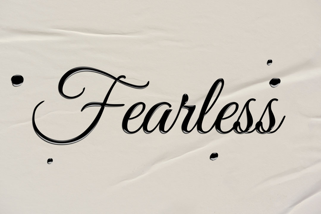
This group encompasses typefaces that appear to have been handwritten, imitating handwritten fonts.
Their usage usually conveys a personal and traditional style, although it's important to note that they don't always offer great readability. Within this group, we can find two sub-categories:
Firstly, there are formal ones inspired by cursive writing. Among these script fonts, we can distinguish between handwritten ones from ancient texts and cursive fonts based on the handwriting of great writers from the 17th and 18th centuries. Both are characterized by thick and thin strokes that depend on the direction of the brush tip while being traced.
The second, more informal group, has imperfect strokes and appears to be written with a brush rather than a pen.
This category includes all font characters with unique styles and characteristics that follow a specific design. They are suitable and specific for signs, titles, and spaces designed to attract attention due to their lower readability.
Obtaining a typography font nowadays is straightforward, with numerous options available: Consulting a designer for a typography font assures you of possessing a unique and exclusive typography font (we all know Coca Cola's exclusive typography font).
Another option is to visit websites that house thousands of typography fonts, such as Google Fonts, for free and with usage rights for designers. This website is widely used in creating a corporate identity as it offers complete font families. Additionally, it provides the option to download the font folder and/or generate a link for web use.
All the fonts you'll see on this page are designed correctly, considering all necessary criteria and aspects.
A third option, although less recommended, would be to search on websites like Dafont. Here, the professionalism in font design tends to vary, and while you'll find a wide range of fonts of all kinds, many of them are created by amateurs and may have errors. These issues could compromise the effectiveness of a logo or the corporate identity of a brand, so it's essential to be cautious in choosing fonts from less reliable sources.
As we've seen throughout this article, typography fonts today are digital files and, as such, have specific formats for their use. This format can vary depending on the operating system in which they need to be installed.
There are different types of formats, each with their own characteristics and similarities:
TrueType is a typographic format created by Apple Computer in the '80s to compete with Adobe's "Type1" format.
This new format represented a breakthrough in the evolution of digital typography, offering font designers greater control over the characters. This control resulted in typographic designs of higher quality and readability compared to previous systems.
A distinctive feature of TrueType was its scalability, meaning fonts could be resized without losing quality. This was particularly valuable in the emerging era of digital publishing and printing, where fonts had to adapt to a variety of sizes and resolutions.
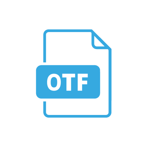
OpenType (OTF) was developed by Microsoft and later introduced to the public in collaboration with Adobe Systems in 1996. Currently, it's the most used typographic format across major platforms.
OpenType fonts are highly versatile and compatible with both iOS and Windows.
They have extensive glyph storage (up to a total of 65,636) and are known for their ability to add advanced typographic features, making them ideal for complex designs and high-quality projects.
Created by Adobe Systems, it is known for high-resolution printing quality and professional graphics. Although less common on the web, it's ideal for high-end projects such as lithographic and offset prints.
It offers precise reproduction of text and graphics, being preferred in the publishing industry. While it may occupy more space and have scalability limitations compared to modern formats, its precision makes it valuable for projects requiring high typographic fidelity.
These are font types designed specifically for use on websites. They are like compressed font packages that load quickly on web pages and work well with modern browsers.
This ensures that text on websites is visible and loads rapidly for an optimal experience.
Unlike other formats, SVG fonts use vector graphics to represent letters and characters. This means that letters are described as mathematical shapes rather than images or outlines, making them ideal for resizing without losing quality.
They are great for logos and custom web designs as they appear sharp at any size and resolution. However, their usage is less common compared to other formats like TrueType or OpenType, which are more versatile and widely compatible.
These fonts store each character as a bitmap image, like a photo.
OpenType fonts are highly versatile and compatible with both iOS and Windows.
They are useful in video games and applications where pixelated text is required, such as in old arcade games.
These fonts are ideal for specific character sizes but do not scale well to different sizes.