shopping_cart
Cart
The brand guideline is the physical and/or digital document that lays the foundations of a company's visual identity. Thanks to this document, you can prevent your brand from falling into bad practices or having its essence badly defined.
This document sets out the practices, limits and prohibitions governing the use of a company's visual identity. It is therefore very important that this manual is ready before the company starts trading, so that its visual identity is respected from the very beginning.
At the very least, the design guideline should contain points relating to the visual identity (logotype, isotype, etc.) and its construction, as well as correct uses and prohibitions, typography, colours, applications, use for advertising or corporate stationery, among other things.
Its main task is to ensure compliance with the rules governing a company's visual identity. In other words, a graphic charter is to a company what a constitution is to a country. It must also remove any doubts or unknowns about a brand's logo, colours, typography, etc. It establishes the criteria that will govern its visual and communicative identity.
Take franchisees, for example: it is thanks to this that all establishments share exactly the same visual identity and are easily identifiable by customers.
More and more companies are providing a 'welcome pack' containing a copy of the graphic charter to each new employee, so that they can learn more about the brand and its work ethic. After reading it, the employee should be able to understand the company, what it does, how it works and how it communicates with its customers.
A logo guide is an element which, although in a reduced and simplified version, accompanies the logo when you entrust it to a designer. So, in the price of a ‘logo design’ that you entrust to a professional, concepts such as research, sketch, result and justification are included. These elements make up a charter.
But it's up to each company to entrust a professional with the creation of a complete, in-depth and detailed brand design guideline. Although this entails an additional cost, it is a necessary and cost-effective expenditure: it is entirely possible to update it and keep it for as long as you like.
To be well structured and really useful, a visual charter must compile a series of essential data.
Although each company has its own charter, with varying degrees of detail, there are always a few essential pieces of information:
A brief presentation of the company to put it in context before reading on.
This explains in more detail why the company was set up, what it wants to achieve, its philosophy and way of doing things, what it wants to convey to its audience, etc.
This is where everything to do with visual communication should be perfectly detailed (colours, typography, tone to be used, logo, variations and adaptations to platforms, etc.).
This is just a very brief summary of the essential points that a brand guidelines document should contain, each of which will be explored in greater detail later in this article.
Some charters are longer and more detailed than others; for each company, there are some points that are more essential and necessary than others. This does not depend on the company's economic capacity, but rather on its size and reputation.

First step: present your company and what it offers to your customers. How would you present yourself to someone who doesn't know you? This is the starting point for a good charter.
Explain who you are, what inspires you in your work: put forward the most human face of your company.
To do this, it's advisable to be brief and to the point, and to avoid rambling. On the other hand, it is advisable to add images to best illustrate your company's philosophy.

Second step: describe your company's general strategy, i.e. explain its mission, vision and values.
Mission: A company's mission is its raison d'être and should be able to answer the questions ‘who am I’ and ‘what do I do’. It is generally expressed in a simple, clear sentence or paragraph. For example: ‘To be a leader in the industry by offering quality products at a good price and to be a visionary when it comes to trends’.
Vision: the vision is the objective that the company has set itself within a certain timeframe. It's a statement of intent, in which you describe where you see yourself in a given timeframe, and how you plan to achieve that goal. For example: ‘In 10 years' time, to become the leading company for buying, restoring and selling classic cars’.
Values: finally, a company's values are how it describes itself and what it wants to pass on to its customers. Sustainable development or equality are examples of values that a company can identify with and that the public will be able to identify with in return.
All these ‘statements of corporate principles’ must be simple, clear and realistic. There is no point in giving too long a deadline or optimistic but unachievable objectives.
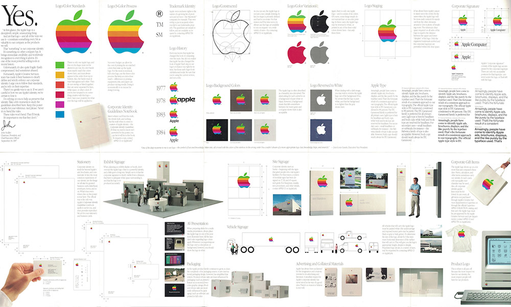
This point is generally subdivided into sections, as the logo is presented in all its forms and its construction, as well as the rules for its use and application, are detailed.
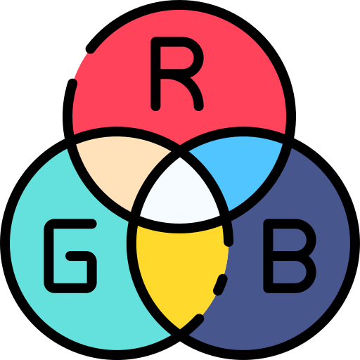
RGB (red-green-blue) is the digital colour system for computer screens and monitors, which is why this colour code must be indicated for the digital representation of the logo.
The sum of the three ‘channels’ of this colour system gives white.
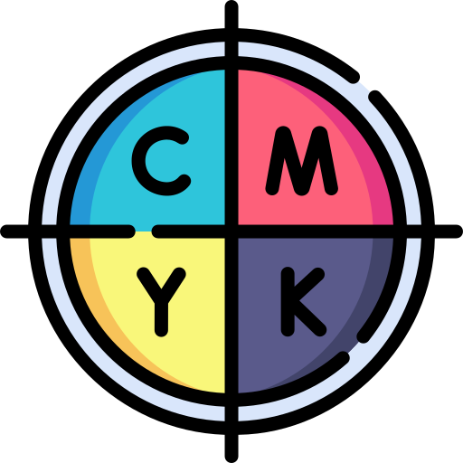
CMYK (cyan-magenta-yellow-black) is a subtractive colour system for printed work. It allows a wide range of colours to be represented and is well suited to industrial media.
The sum of the three colours (cyan, magenta and yellow) would give black, but this would not be black as we know it, but rather a brownish hue, which is why black ink is added to the mixture.
Hexadecimal is a colour system for computer use, linked to the HTML programming language.
Under this system, each colour has a six-digit code, preceded by a hashtag. Each symbol has a meaning:
In this way, the complete hexadecimal code for a colour is formed by adding together the colours of each pair of digits. For example, colour #FFFF00 is the sum of red and green, without any blue, i.e. yellow.
Pantone is an American brand specialising in the manufacture of inks. It has colour libraries in which it specifies the formula for creating specific shades.
The system is based on a palette or colour chart (Pantone color bridge) which contains small cards showing the colours to be printed (on coated and uncoated paper) and the codes needed to produce them exactly.
Each colour is described by a number accompanied by an acronym according to the material on which it will be printed:
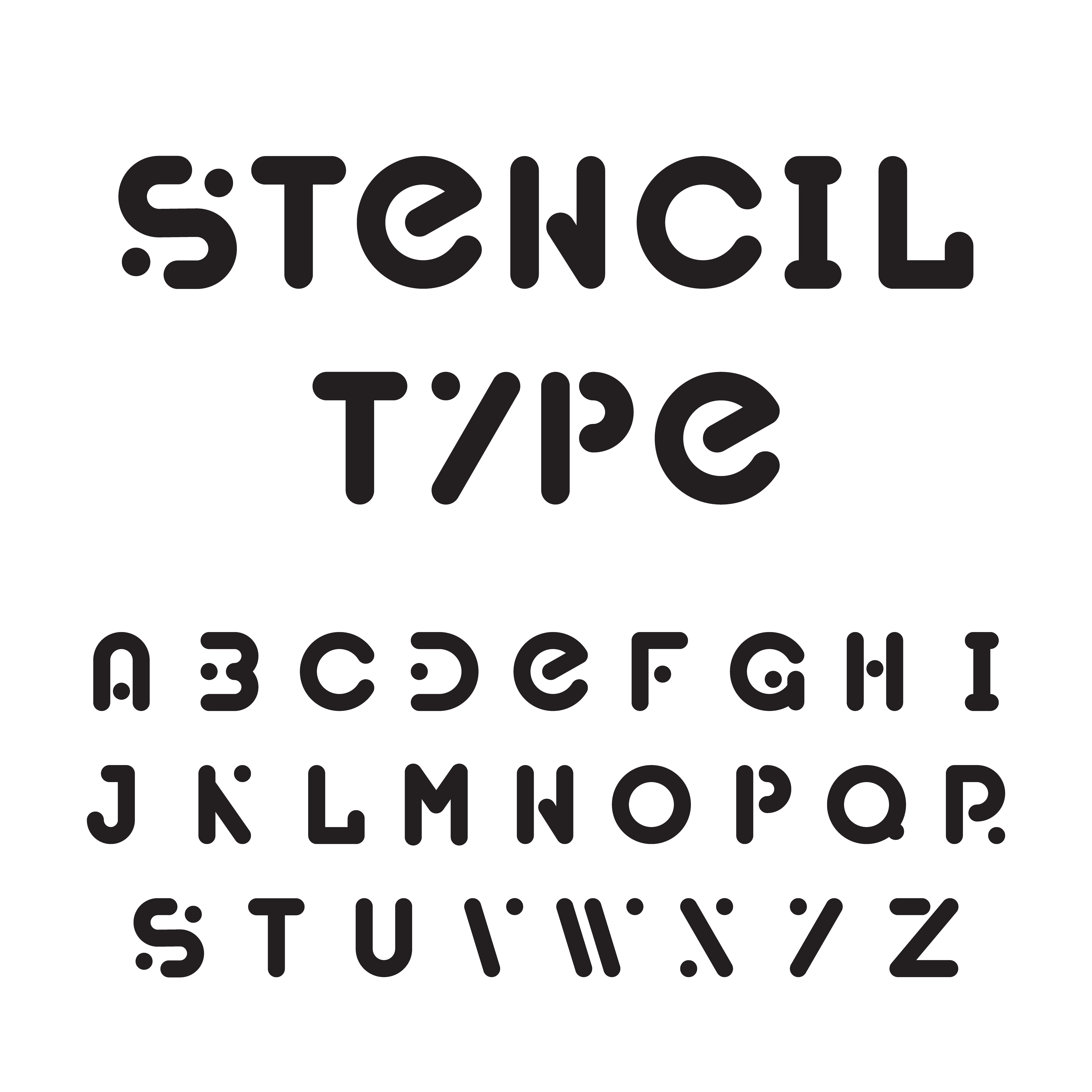
Your company's typography needs to be described in detail: the typeface, the use of bold or italics, the possible combinations, etc.
Like any business, you need to communicate with your customers. There are many ways of starting a conversation with your customers, and the way you choose can make the difference between success and failure.
Language refers to the words, images and tone a company uses to communicate, both internally between its departments and employees, and externally with its customers.
Different approaches are possible, and there are several factors to take into account. A historic company, several centuries old, will certainly prefer more formal communication. On the other hand, a recent, modern company targeting a younger audience will happily adopt a more colloquial tone (while respecting the limits of professionalism).
For language to be effective, three points need to be taken into account:
The company's various departments must use the same language, terms and nomenclature.
Use simple, clear language with the user experience in mind.
In order to forge strong links, the company must first define its target audience clearly so as to know what tone to adopt; a distinctive, clean tone, in keeping with the spirit of the company while allowing it to stand out from the competition.
How is the brand represented? How many versions of the logo have you created? Now it's time to go into more detail and present the different types of logo possible:
Your logo is an image or icon, without text; these are often abstract or simplified graphic representations of the brand. An example: Whatsapp.

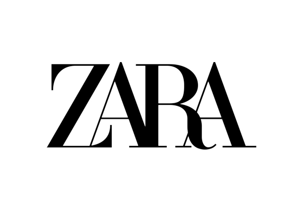
Your logo is the name of your brand, written out in full. An example: the ZARA brand, whose logo is simply the name of the brand written in a serif font.
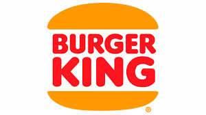
Your logo contains an image and text superimposed on each other, making them indissociable; remove either of these elements and the brand is no longer recognisable. For example: Lay's or Burger King.
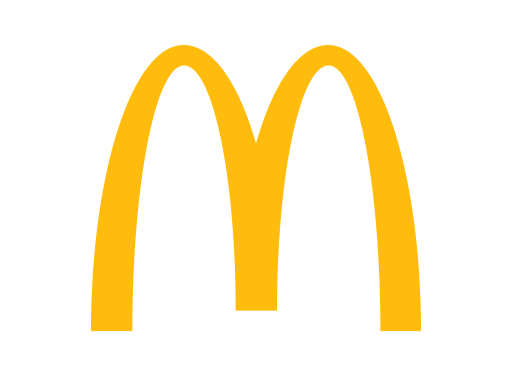
Your logo contains text and an image; these two elements are detachable, as they are not superimposed, and can function separately. An example: McDonald's, easily identifiable either by the yellow M, or by the full brand name, or by both combined.
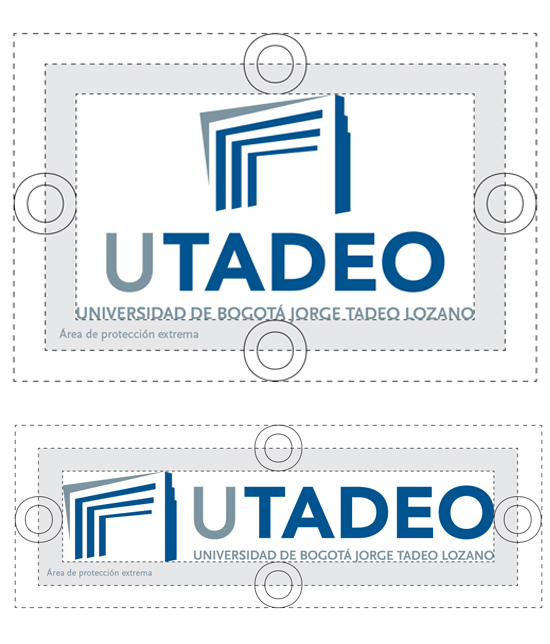
Just like us, your logo needs its own personal space. No-one wants to see their logo next to or on top of another. To avoid this, a zone surrounding your logo, called the safety zone, can be created to guarantee a minimum safe distance from any other element.
To do this, the logo is presented in its main form with a grid, where an initial unit of measurement is established (called an X) and from which you detail the dimensions of the reserved space. This procedure must be repeated for all existing versions of the logo, keeping the same basic unit of measurement.
It's not a question of explaining and detailing the process of creating the logo - that's something that not even graphic designers are responsible for doing - but rather of indicating its proportions.
The logo is therefore generally presented on a grid, framed by a basic unit of measurement (usually X) so that the proportions can be assessed.
Everything has its limits, and the same applies to the legibility of a logo. That's why, when designing your logo, it's a good idea to check the minimum size that can be achieved without any loss of legibility or visibility. To do this, it is advisable to represent the gradual reduction of the logo or image from its original size. Copies are made (generally placed side by side) and gradually reduced in size.
It is important to caption each copy with the dimensions of each reduction. After several repetitions, a minimum size will be reached at which the text becomes illegible or the details imperceptible, making the logo unusable. Once this has been done, clearly indicate which size is preferable not to reach (as an example), as well as the size limit to which the logo can be reduced.
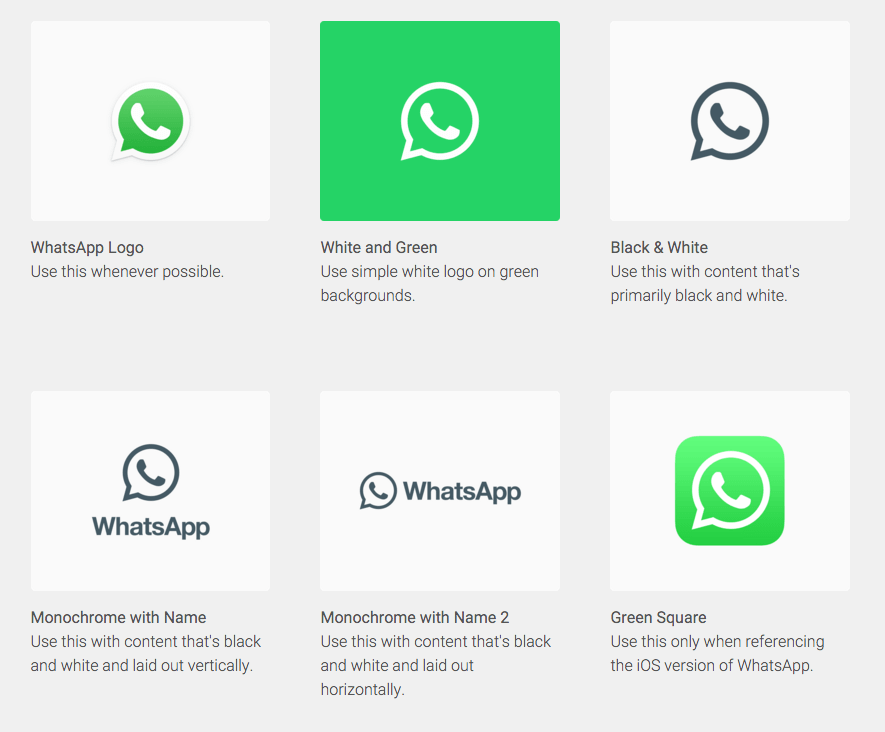
These days, we have a wide variety of media on which our logo can be represented. To avoid any problems of visibility or legibility, we need to create several versions of our logo, so that it is always adaptable.
It is common to create a main version, horizontal and/or vertical, in negative, multicoloured and/or monochrome, etc. Be sure to caption each version, detailing where it is used and why.
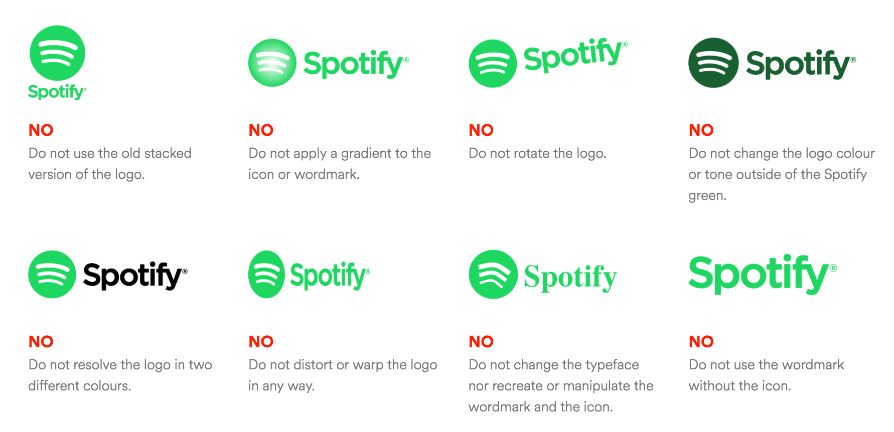
What can't you do with your logo? What compositions are prohibited? What customisations should you avoid? Adding elements, changing colour or typography, rotating, etc. are all modifications frequently made to adapt the logo to holidays or calendar events, for example.
Anything you wish to prohibit should be detailed in this section.
This is where we show you some photographic examples of possible uses for your logo, so that you can see for yourself how it can be applied in a more practical way.
Your logo on a delivery lorry, a billboard, an invoice, a pen, and so on. There's no need for real prints and photographs; they can simply be photomontages (made in Photoshop, for example).
Simulation is more than enough, especially if your company cannot yet afford to make this kind of investment.